Are descriptions for fields and boxes easy to understand?
Answer: Sometimes
Score: 1
Notes: Descriptions for fields and boxes that are provided are consistently clear and easy to understand. Though, there are missing labels as identified by the Wave tool.
Are labels placed above the user input fields and clearly associated with each field?
Answer: Sometimes
Score: 1
Notes: A mixture of labels placed beside or above the corresponding field.
Are text cues for coloured form control labels available?
Answer: Always
Score: 2
Notes: A red text cue and boxes will appear at the top of the form if the user fails to enter the required information correctly.
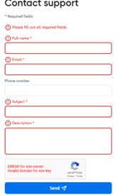
Are other visual indicators provided consistently, such as an asterisk for required form fields?
Answer: Sometimes
Score: 1
Notes: An asterisk symbol appears as the visual indicator for the forms field that require filling out.
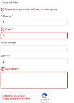
Are alert messages clearly visible to the user, either at the top of the form field, inline, or through a dialog box?
Answer: Always
Score: 2
Notes: An error message does not display on the contact us screen when fields are entered incorrectly.
Do alert messages clearly indicate the field in which the error has occurred and a description of the error and the fix?
Answer: Sometimes
Score: 1
Notes: An error message provides the user with a description of the areas to fill out if missing or invalid information is provided. See the image from the previous question. Not able to test without logging out of the resource. There is no option to create an additional account in addition to the institutional login.
Is the user able to easily access the user input field to correct the error?
Answer: Sometimes
Score: 1
Notes: For the form that was tested, users were able to easily access the input field to correct errors. However, this behaviour could not be confirmed for the Create Account or Sign In forms.
Is the user able to resubmit the form and re-validate their submission?
Answer: Sometimes
Score: 1
Notes: Only if the user is creating a new account.
Do error reports follow a logical reading and navigation order?
Answer: Always
Score: 2
Notes:
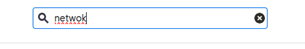
When a user spells a word incorrectly, does the search function offer spelling suggestions or synonyms?
Answer: Sometimes
Score: 1
Notes: When entering a misspelled word in the search field, no suggestions or synonyms appear. Though, the misspelling is marked with a red squiggly line, which appears only when the cursor is in the search box. However, there is no suggested correct spelling for the word from the results page.
Are icons such as to save, download, or print consistent across the site?
Answer: Always
Score: 2
Notes: Icons are consistent across the site.
Is alternative text clear and consistent for each icon type?
Answer: Always
Score: 2
Notes:
Are actions consistently labelled across the site? For example, the “search” button is always labeled “search”.
Answer: Always
Score: 2
Notes: Yes actions are labelled consistently across the site. The search button for example is located in the header on all pages.
Are icons that have adjacent links consistent?
Answer: Always
Score: 2
Notes:
Can the purpose of each link be determined from the link text alone?
Answer: Always
Score: 2
Notes: Yes. The purpose of the link can be determined by the text.
Does the eresource have a consistent layout and navigation across all pages?
Answer: Always
Score: 2
Notes: The layout and navigation is consistent throughout the database. The same information and links appears in the header on all pages.
Are search fields located in the same places throughout the website?
Answer: Always
Score: 2
Notes: The search field is located in the header.
Do other features occur in the same place throughout the website?
Answer: Always
Score: 2
Notes: Header contains the O’Reilly Logo, Menu options (Explore Skills List, Start Learning, Featured, and Answers), search bar and profile List.
Does the electronic resource avoid the use of pop-up windows which open automatically in a new tab if a user clicks on a button?
Answer: Sometimes
Score: 1
Notes: There is only one detected pop-up that appears as a contact form. This only appears when the user clicks the link.
Does the database avoid launching pop-up windows automatically when the database is loaded?
Answer: Always
Score: 2
Notes:
Where pop-ups occur, are users able to postpone or suppress any pop-ups?
Answer: Never
Score: 0
Notes: The pop-up that appears cannot be postponed or suppressed. But it only appears if the user wants to submit a contact form.
Does the database avoid launching pages in a new browser window with the usual browser controls missing?
Answer: Always
Score: 2
Notes:
Is page content subdivided hierarchically into appropriate headings and tagged appropriately?
Answer: Always
Score: 2
Notes:
Are headings concise and clear, and accurately reflect the content under that heading?
Answer: Always
Score: 2
Notes:
Does the main navigation and drop-downs contain a reasonable number of menu items?
Answer: Always
Score: 2
Notes:
Can all menus and submenus be accessed with screen readers and via keyboard navigation?
Answer: Always
Score: 2
Notes: All menus and submenus are accessible with screen reader and keyboard navigation.
Does the “results” page or item record view avoid opening in a new tab without a warning?
Answer: Always
Score: 2
Notes:
Is there an "update now" button that requests a refresh of content rather than automatically updating the content?
Answer: Always
Score: 2
Notes: O’Reilly search results update only in response to user selected filters or refresh actions. Content does not update automatically, meeting the intent of this criterion.
Does the database avoid automatic redirection?
Answer: Always
Score: 2
Notes:
Does the database avoid launching new windows when a component receives focus?
Answer: Always
Score: 2
Notes:
Does the database avoid change of focus when a component receives focus?
Answer: Always
Score: 2
Notes:
Are you able to tab through a page using keyboard navigation without the keyboard focus moving away from the control?
Answer: Always
Score: 2
Notes: