Glossary
This glossary provides definitions and examples for accessibility terminology used in LEAP assessments.
Select a letter to browse the glossary alphabetically.
Additional Glossaries with Web Accessibility Terminology:
A
Anchor Tag
An anchor tag or anchor link is a web page element that links to another location on the same page. They are typically used for long or text-heavy pages so that visitors can jump to a specific part of the page without having to scroll excessively.
Assistive Technology
Software or hardware that has been specifically designed to assist people with disabilities in carrying out daily activities. In the area of Web Accessibility, common software-based assistive technologies include screen readers, screen magnifiers, speech synthesizers, and voice input software that operate in conjunction with graphical desktop browsers. Hardware assistive technologies include alternative keyboards and pointing devices.
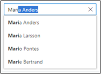
Autocomplete Text
Autocomplete text is one or more content suggestions based on what you started to type. The goal of autocomplete is to help you complete a sentence or input information, such as a URL in your browser’s address bar, with fewer keystrokes.
B
Bitmap
Bitmap is a file format or memory organization of rows and columns of bits (or pixels) that collectively display a graphical representation.
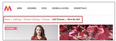
Breadcrumbs
Breadcrumbs are a secondary navigation aid that helps users easily understand their location on a page in relation to the website's overall hierarchy. It is a text path, located at the top of a page, which reflects the site structure of the website. It tells users where they currently are on the site and helps search engines to understand the structure of a website.
Browser Extension
A browser extension is a small application that adds capacity or functionality to a browser.
Button / Command Button
A button is an interactive element activated by a user with a mouse, keyboard, finger, voice command, or other assistive technology. Once activated, it performs an action, such as submitting a form or opening a dialog.

C
Captions
Captions are synchronized visual and/or text alternatives for both speech and non-speech audio information needed to understand the media content.
Carousels
Carousels show a collection of items one at a time. They are also known as “slideshows” and “sliders” ; typical uses of carousels include scrolling news headlines, featured articles on home pages, and image galleries. Learn more
Clickability Cues
A visual indication that a given word or item on a webpage is clickable. Cues that can be used to indicate the clickability of an item include color, underlining, bullets, and arrows.
Closed Captions
Closed captions are a textual representation of the audio within a media file. They make videos accessible to deaf and hard of hearing users by providing a time-to-text track as a supplement to, or as a substitute for, the audio. Closed caption encoding allows the user to turn the captions on or off on offline videos.
Complex Images
Complex images contain substantial information – more than can be conveyed in a short phrase or sentence. These are typically graphs, charts, diagrams, illustrations, and maps. Learn more
Controls
Controls are user interface elements that users interact with on an app’s main window area.
D
Decorative Images
Decorative images do not add information to the content of a page. For example, the information provided by the image might already be given using adjacent text, or the image might be included to make the website more visually attractive. Learn more
Dynamic Content
Dynamic content in the context of HTML and websites refers to website content that constantly changes based on user interactions, timing and other parameters that determine what content is delivered to the user. Any element in a page which contains movement and can change over time may be considered as dynamic content also, so a website that has a lot of animations for user interaction, even without dynamically changing content, may still be considered a dynamic website because elements change depending on context or conditions.
E
Element
In XML, an element is the central building block of any document. Individual elements can contain text, other elements, or both.
Extensions
Extensions are small software programs that customize the browsing experience. They enable users to tailor browsers' (e.g. Chrome, Firefox, Edge) functionality and behavior to individual needs or preferences. A single extension can include multiple components and a range of functionality, as long as everything contributes towards a common purpose.
F
Field Labels
Field labels tell users what the corresponding input fields mean.
Focusable
An element is focusable of one or both of the following are true:
- The element is part of sequential focus navigation.
- The element has a tabindex value that is null.
Form Control
A form control is a user interface control that serves as the point of connection between the user and the server. Form controls enable accessibility by taking a uniform approach to such features as captions, help text, tabbing and keyboard shortcuts.
Form controls when rendered display the underlying data values to which they are bound. Form controls include checkboxes, text inputs, and radio buttons.


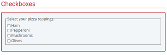
Form Fields
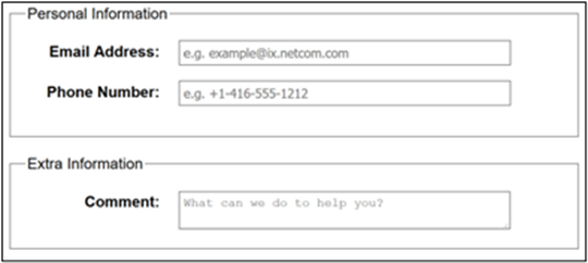
Form fields and other form controls usually have visible labels, such as “E-mail Address:” as the label for a text field. When these labels are marked up correctly, people can interact with them using only the keyboard, using voice input, and using screen readers.

Forms
Forms are used to provide user interaction on websites and in web applications. For example, login, registering, commenting, etc. Learn more
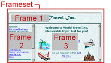
Frame
Frames create independently changeable and scrollable windows that tile together to break up and organize a display. Frames are no longer part of HTML. Because of limited support and difficulty in making them accessible and highly usable, frames should typically be avoided.
Functional Images
Functional images are used to initiate actions rather than to convey information. They are used in buttons, links, and other interactive elements. Learn more
G
Groups of Images
Sometimes groups of images are used together to represent one piece of information. For example, a collection of star icons that together represent the rating. In this case, only one of the images needs a text alternative to describe the entire collection. Learn more
H
Heading
A heading describes the content that follows it, much like a news headline. When arriving at a new page, sighted users gravitate toward headings to quickly find what they want on the page. Screen reader and other assistive technology users can also skip from heading to heading.
Headings are nested by their rank or level. The most important heading has the rank 1 (<h1>), the least important heading has the rank 6 (<h6>). Headings with an equal or higher rank start a new section, headings with a lower rank start new subsections that are part of the higher ranked section.
Headings are useful for labeling page regions. If the headings are visible, the regions are easy to identify for all users. Learn more
Horizontal Scrolling
Horizontal scrolling is the act of scrolling from one side of a page to the other.
HTML Tag
HTML tags are the keywords on a webpage that define how your web browser must format and display your web page.
I
Icon and Adjacent Link
An icon with alt text and a link that are next to each other and go to the same location. The link text for these two links needs to be consistent, not identical. The best practice is to have identical text so that when users encounter the second one, it is clear that it goes to the same place as the first.
Icons
Icons are pictorial representations of objects, important not only for aesthetic reasons as part of the visual identity of a program, but also for utilitarian reasons as shorthand for conveying meaning that users perceive almost instantaneously.
![]()
Image Contrast
The difference in brightness between light and dark areas of an image. Contrast determines the number of shades in the image.
Image Map
Image maps allow different parts of an image to become different clickable elements (and can also allow some portions of the image to have no clickable element). Learn more
Informative Images
Informative images convey a simple concept or information that can be expressed in a short phrase or sentence. Learn more
Inline Frame / iFrame
Inline frames allow the inclusion of distinct web documents (and even entire web sites) within a subwindow of a parent web page without the hassle of defining a frameset document. The content of the inline frame is read at the point it is encountered (based on markup order) as if it were a content within the parent page.
Inline Label
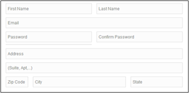
A label set as a placeholder in an input field. It will disappear once the field gains focus; the user will no longer be able to view it.
Input Error
Information provided by the user that is not accepted.
Input Fields
These include text fields, password fields, checkboxes, radio buttons, sliders and any other fields designed for user input.
Input Focus
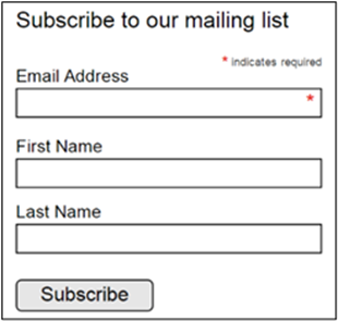
Input focus is the current assignment of the input from an input device to a user interface object (a window or an object within a window).
K
Keyboard Focus
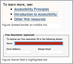
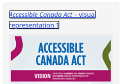
Keyboard focus should be visible and should follow a logical order through the page elements.
Keyboard Interface
Interface used by software to obtain keystroke input. It allows users to provide keystroke input to programs even if the native technology does not contain a keyboard.
L
Label
A label is text or other component with a text alternative that is presented to a user to identify a component within the Web content. Clearly written labels are one of the primary ways to make a User Interface more accessible. A good label tells the user the purpose of the field, maintains its usefulness when focus is on the field itself, and remains visible even after the field has been filled in.
Layout
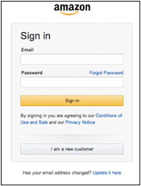
The layout of a website is the arrangement of all visual elements on a page. This includes the position of the logo, navigation, text, and images. The layout is the foundation of a website’s design and is used to guide the user through the page.
Link / Hyperlink
A link in HTML is any element that when activated, directs the browser to some other location or file, either on the same page, a different page on the same site or a different site altogether. The link can be text or an image or several other HTML elements.
Link Text
Link text should be unique within a page, should be meaningful when read out of context, and should help users know something about their destination if they click on it.
Liquid Layout
A liquid layout is one that is based on percentages of the browser window’s size. The layout of the site will change with the width of the browser, even if the visitor changes their browser size while viewing the page. Liquid layouts take full advantage of a person’s browser width, optimizing the amount of content you can fit on screen at one time.
M
Markup
In HTML, the term markup is often used to refer to the HTML text for a given page. Technically, markup refers to the tags that accompany the page content that direct the browser as to what the content is and how to display it.
Menu
A list of commands or options available to users in the current context.
N
Navigation
In design terms, this refers to the system that enables users to move around a website that together forms a navigational element allowing the user to easily find their way around a website.
Navigation Bar
A navigation bar is a collection of links to the most important parts of a document or site. It is typically displayed either horizontally or vertically.
Null Alt Text
The purpose of this technique is to show how images can be marked so that Assistive Technology can ignore them. If no title attribute is used, and the alt text is set to null (i.e., alt=””) it indicates to assistive technology that the image can be safely ignored.
O
Open Captions
Open Captions are any captions that cannot be turned off. For example, if the captions are visual equivalent images of text embedded in video.
P
Pixelated
The term is used to describe an image in which the individual pixels are visible to the naked eye.
![]()
Pixels
This refers to the smallest element of a digital image. As dots per inch (dpi) or pixels per inch (ppi), pixels also serve as a unit of measure that determines how an element will look on a webpage layout.
Placeholder Text
Placeholder text is the label for possible content in a text box. It can normally be found when there are prompts to fill out a form.
Progress Bar
Progress bar is a graphical control element used to visualize the progression of an extended computer operation such as a download, file transfer, or installation.

R
Radio Button
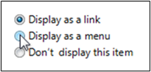
Radio buttons are normally presented in radio groups (a collection of radio buttons describing a set of related options). Only one radio button in a group can be selected at the same time.
Regions
Most pages have a visual structure with a block of content (typically logo, navigation, search, etc.) at the top, a main content area, a footer, and sometimes sidebars with related information. Page regions define the essential semantic structure of a page. The terms “region” and “landmark” are often used synonymously.
Resolution
Resolution refers to the degree of sharpness of an image. This typically pertains to display screens or images. In both cases, resolution is characterized by how many pixels are contained within a set space. Images and displays on a screen are made up of millions of pixels, each displaying a particular color which together make up an image or screen display. The more pixels available in a space, the higher the resolution, resulting in a sharper image.
Resolution Test
Resolution Test is an extension for developers to test web pages in different screen resolutions, with an option to define your own resolutions.
S
Scaling
Scaling means zooming. To scale an object means to make the object larger or smaller.
Screen Magnifier
A software program that magnifies a portion of the screen, so that it can be more easily viewed. Screen magnifiers are used primarily by individuals with low vision.
Screen Reader
Software that enables people with impaired vision to use computers. It reads the text on the screen in a computerized voice. People interact with the computer using a standard keyboard. Most screen readers can also convert text into braille if the user owns a braille display device. Screen readers hold the key to education and employment for many people with vision impairments. Learn more
Scrolling
Scrolling is considered one of the basic methods of user navigation. Some applications can be scrolled line-by-line or page-by-page. The majority of browsers and application windows can be scrolled freely using certain equipment, namely mouses, keyboards, touchpads, and touchscreens. Scrolling can be vertical or horizontal.
Skip Links
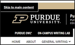
Skip navigation links are useful to give Screen Reader and keyboard users the capability of navigating directly to the main content.
T
Tabindex
The tabindex content attribute allows authors to make an element and regions that have the element focusable.
Tag
A tag is a set of markup characters that are used around an element to indicate its start and end. Tags can also include HTML or other code to specify how that element should look or behave on the page.
Tagged PDF
Tagged PDF is a version of PDF that provides structure and orders information to allow PDF documents to be read by screen-readers and to be reflowed to fit different display screen sizes. To accomplish this, Tagged PDF marks, or tags, the various elements that make up a page.
Text Cue for Colored Form Control Labels
The objective of this technique is to combine color and text or character cues to convey information. Most users can quickly scan the content to locate information conveyed by using color differences. Users who cannot see color can look or listen for text cues; people using braille displays or other tactile interfaces can detect text cues by touch. The text cue must be included as part of the programmatically determinable name for the control.
Text Magnifier
Text magnifiers makes part or all of your screen bigger so you can see words and images better. To quickly turn on Magnifier, press Windows logo key + Plus sign (+). To turn off Magnifier, press the Windows logo key + Esc. Learn more
Text-to-Speech
The process of automatic generation of speech output from text or annotated text input.
Transcript
A transcript is a text representation of sounds in an audio clip or an auditory track of a multimedia presentation. A text transcript for a video combines caption text with text descriptions of video information (descriptions of the actions, body language, graphics, and scene changes of the visual track). Text transcripts are essential for individuals who are deaf-blind and rely on braille for access to movies and other content.
U
User Interface
User Interface or UI refers to the set of controls and actions that enable users to experience and interact with a website and its contents. User interfaces include elements like menus and toolbars, buttons, windows and tabs, and the like.
V
Vertical Scrolling
Vertical scrolling is the act of scrolling up and down a page. This is the most common type of scrolling as most sites and applications will match a window’s width but not the height.
Visual Focus
Focus determines where keyboard events go in the page at any given moment.
W
WAVE Browser Extensions
WAVE Chrome, Firefox, and Edge browser extensions are available for testing accessibility directly within your web browser – handy for checking password protected, locally stored, or highly dynamic pages.
X
XForms
XForms is an XML application that represents the next generation of forms for the WEB. Learn more
XML
Stands for Extensible Markup Language. XML is a specification for creating other, custom markup languages. It is an extensible language because it allows for the user to define the markup elements.