Are descriptions for fields and boxes easy to understand?
Answer: Sometimes
Score: 1
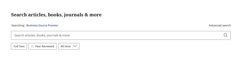
Notes: On the Simple search page, there is a button labelled "All Time" with a drop down arrow, which is intended to give access filters for publication date. I don't think this wording gives a clear indication of what this button does.
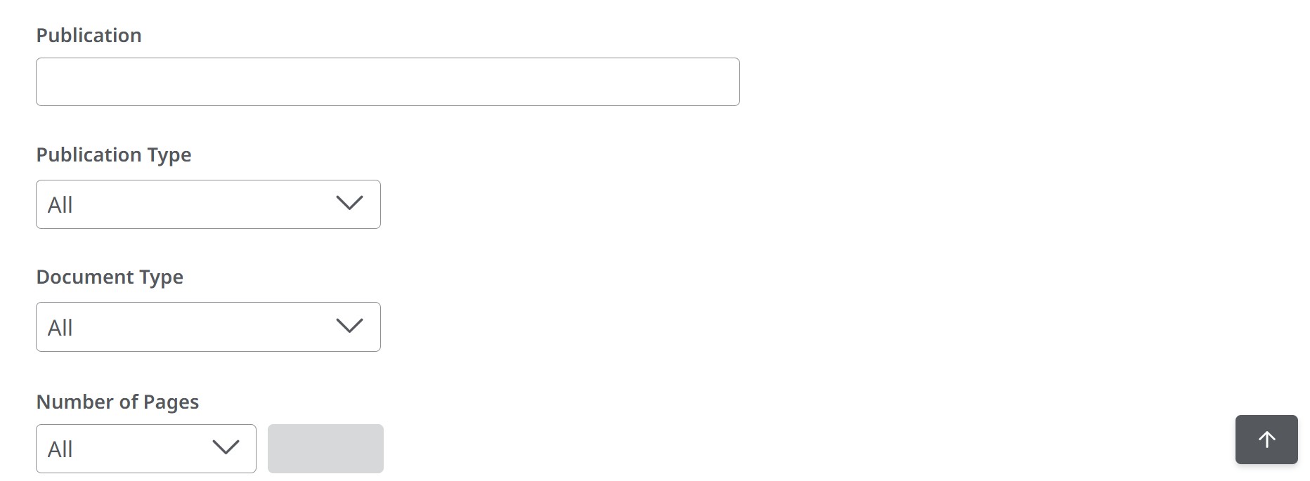
In Advanced search, there is a field for "Publication", which perhaps should say "Publication title".
I don't understand what the difference is between the indexes for "Publication Type" and "Document Type". The contents of the drop down boxes are not identical, but there is overlap. For example, both indexes have a line for "book". Meanwhile, the user cannot include (or exclude) multiple categories in either of these indexes...there are no check boxes.
Are labels placed above the user input fields and clearly associated with each field?
Answer: Always
Score: 2
Notes: When they are present, labels are above the field they are associated with.
Are text cues for coloured form control labels available?
Answer: Not Applicable
Score: -1
Notes: No exclusively coloured form controls present. While colour is present, there is a "filling in" of the checkbox or radio button as well, and there is no specific colour being used (eg. red for negative, green for positive) when a control is selected.
Are other visual indicators provided consistently, such as an asterisk for required form fields?
Answer: Not Applicable
Score: -1
Notes: For the application for an EBSCO account there are few required fields, and they do not use visual indicators for required fields. There is one field that has a text label to say that the "Last name" is "(optional)". The password field has "X" marked beside descriptions of what is allowed or not allowed, and required in a password. This "X" could just as easily been a decorative bullet, as it does not mean "do not use the following".
Are alert messages clearly visible to the user, either at the top of the form field, inline, or through a dialog box?
Answer: Sometimes
Score: 1
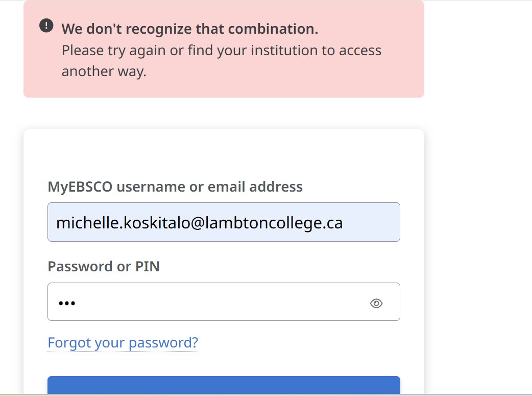
Notes: Signing into MyEBSCO, if the client does not enter the correct password, the message is "Please try again or find your institution to access another way."
There is no option on this form to "find your institution", which is confusing. The message is however clearly visible, at the top of the form.
On the "create your account" page, if one leaves a required field blank, the blank is highlighted (in red), and underneath it there is a message with instructions: "Please enter a valid password."
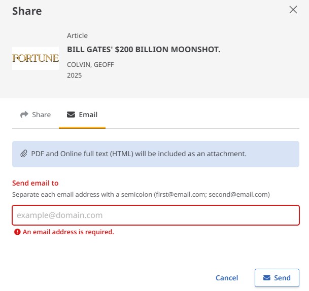
To share an article, an email address must be entered. If this is left blank the error message is also below the place where the data must be entered.
Do alert messages clearly indicate the field in which the error has occurred and a description of the error and the fix?
Answer: Sometimes
Score: 1
Notes: Signing into MyEBSCO, if the client does not enter the correct password, the message is "Please try again or find your institution to access another way." This does not specify that the error is with the password field, and fix suggested may or may not be relevant...there is no "institution" drop down list on this form.
Is the user able to easily access the user input field to correct the error?
Answer: Always
Score: 2
Notes:
Is the user able to resubmit the form and re-validate their submission?
Answer: Always
Score: 2
Notes:
Do error reports follow a logical reading and navigation order?
Answer: Sometimes
Score: 1
Notes: Error reports are frequently below the field that requires a fix, rather than above them.
When a user spells a word incorrectly, does the search function offer spelling suggestions or synonyms?
Answer: Never
Score: 0
Notes: As one types, there are suggestions generated, but this is a predictive text function rather than a spelling correction. I was also unable to find a way to get the screen reader NVDA to access those predictions.
Are icons such as to save, download, or print consistent across the site?
Answer: Always
Score: 2
Notes:
Is alternative text clear and consistent for each icon type?
Answer: Always
Score: 2
Notes:
Are actions consistently labelled across the site? For example, the “search” button is always labeled “search”.
Answer: Never
Score: 0
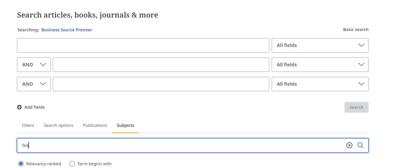
Notes: To start a search for an article, there are entry blanks to key in words, and then there is a button labelled "search" in the bottom right corner of that area of the pane. In contrast, to search in the index for a "subject" term, there is no button labelled "search". Instead there is the icon of a hand lens inside the blank, at the far right, after a delete keystrokes icon that only appears after keystrokes have been entered.
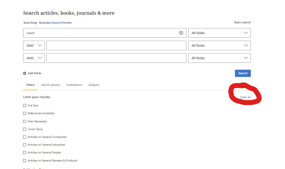
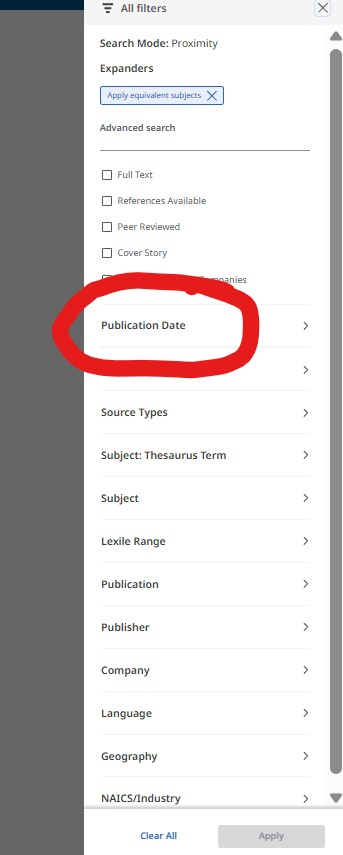
The general search bars for both simple and advanced search have a contextual icon (x inside a circle) for clearing one specific search bar. The filters tab has a link option at the far right "clear all", but the search options tab has the option saying "reset". The "all filters" button opens a side window that says "clear all" in a link at the far bottom of the window, beside "Apply".
Are icons that have adjacent links consistent?
Answer: Always
Score: 2
Notes:
Can the purpose of each link be determined from the link text alone?
Answer: Sometimes
Score: 1
Notes: From the advanced search page, there is a "clear all" link, which applies only to the filters, not the entire page. The filters tab is the default, so it will show up each time the page loads.
The button that adds publication date filters is labelled "All time" by default. I would have preferred "publication date", which is the heading under "All filters" which contains "All time" as a radio button.
Most link text is clear however.
Does the eresource have a consistent layout and navigation across all pages?
Answer: Sometimes
Score: 1
Notes: The basic search page starts out with three buttons under the search bar: full text, peer reviewed, all time. However, on the simple search result page, suddenly there are five buttons: All filters, full text, peer reviewed, all time, and source type, which is the same as what would show on the advanced search result page.
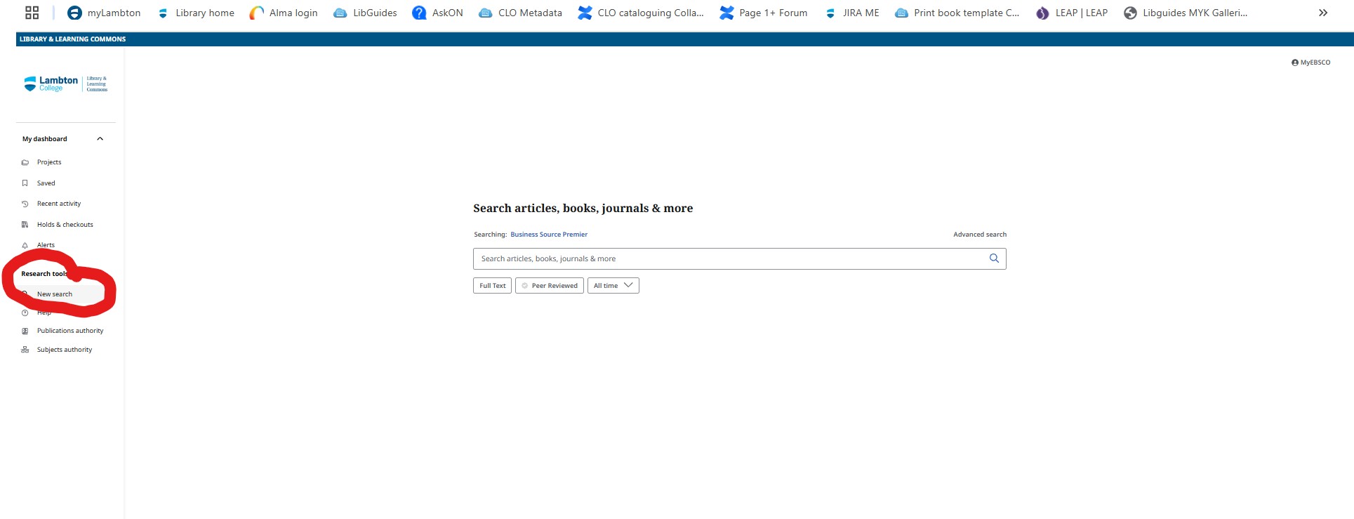
The research tool "new search", which clears the filters from a given search, is located in the left pane of the screen. If the client has been using "basic search", and they then click this button, they are brought to the advanced search page, rather than the basic search page.
Are search fields located in the same places throughout the website?
Answer: Sometimes
Score: 1
Notes: Search bars for Publications and Subjects are consistently located, but they are below the main search bars, rather than in a separate page, even if we select "publications authority" or "subjects authority" from the left pane. I think that people will be expecting the search bar for Publications or Subjects to appear at the top of the page, not in the middle of the page, possibly even obscured from view on a smaller screen resolution. This said, I am guessing that this was a deliberate choice, to allow people to access the indexes and not lose their place or their search string...subject and publication indexes are tools which help us to build search strings, and perhaps nesting them with the main search bars helps bring greater usage of these tools.
Do other features occur in the same place throughout the website?
Answer: Always
Score: 2
Notes: There is a separate left side pane to hold onto most of the key tools including "new search", which clears the data in the pane to the right, "help". and quick links to the "subject authority" controlled vocabulary list or thesaurus, and the "publications authority".
The sign in for MyEBSCO is at the top right of the other pane however. Users must be signed in to be able to use bookmarks, to save articles to folders, or to have access to search history. I wonder if MyEBSCO should actually be in the left pane, near the top.
Does the electronic resource avoid the use of pop-up windows which open automatically in a new tab if a user clicks on a button?
Answer: Never
Score: 0
Notes: Pop ups do not open as "tabs".
Does the database avoid launching pop-up windows automatically when the database is loaded?
Answer: Always
Score: 2
Notes:
Where pop-ups occur, are users able to postpone or suppress any pop-ups?
Answer: Never
Score: 0
Notes: Clicking on "All filters" directly leads to the pop up for that item opening.
Clicking on the link for MyEBSCO directly leads to the pop up.
There is no suppression mechanism that I can find.
Does the database avoid launching pages in a new browser window with the usual browser controls missing?
Answer: Always
Score: 2
Notes:
Is page content subdivided hierarchically into appropriate headings and tagged appropriately?
Answer: Never
Score: 0
Notes: There are headings sometimes.
For example, the sole Header 1 on the page is for the "Search articles and books". This is followed by Header 2 that read "My dashboard", then "Research tools", and "Limit your results"
Are headings concise and clear, and accurately reflect the content under that heading?
Answer: Sometimes
Score: 1
Notes: An appropriate clear example of a heading is "limit your results". However, "My dashboard" sounds almost like it should be "settings", but it is really where client saved information goes, bookmarks and folders. "Research Tools" contains four items in the left pane: New search, help, publications authority, subject authority. In the right pane there are four tabs including "filters", (which to me is "limit your results"), "Search options" (which is about shortcuts that librarians and expert searchers use), "Publications" (which should be a match for "publications authority"), and "Subjects" (Which is "subject authority).
Does the main navigation and drop-downs contain a reasonable number of menu items?
Answer: Always
Score: 2
Notes:
Can all menus and submenus be accessed with screen readers and via keyboard navigation?
Answer: Always
Score: 2
Notes: Keyboard: always
Screen reader:
Advanced search page:
The menus in the advanced search form are all accessible with NVDA and the keyboard together. Filters, Search options, publications and subjects tab materials are all accessible.
Results page: All functions are accessible with NVDA.
My EBSCO signin: All functions are accessible with NVDA
Does the “results” page or item record view avoid opening in a new tab without a warning?
Answer: Always
Score: 2
Notes:
Is there an "update now" button that requests a refresh of content rather than automatically updating the content?
Answer: Always
Score: 2
Notes: Search page requires you to click "search" after fields are filled.
All filters page has a button "Apply" after fields and boxes are selected.
Create account has a button "create account" to click after fields are filled.
Does the database avoid automatic redirection?
Answer: Always
Score: 2
Notes:
Does the database avoid launching new windows when a component receives focus?
Answer: Always
Score: 2
Notes:
Does the database avoid change of focus when a component receives focus?
Answer: Always
Score: 2
Notes:
Are you able to tab through a page using keyboard navigation without the keyboard focus moving away from the control?
Answer: Always
Score: 2
Notes: