Are the images positioned prominently and easy to find?
Answer: Sometimes
Score: 1
Notes: Home page: corporate logo top left; block of small corporate logos mid-page; sequence of banners that are image files that automatically change, so some are "hidden";
Top subjects page: image as text (corporate logo) is in top left corner; there are images that are buttons for Film clips and film clips with learning guides across the middle of the page...[not sure that these are obvious]
advanced search page NA
The results page: images include the video covers, and the corporate logo at the top. All easy to find
item records 1: buttons to play video are images, image of video cover, corporate logo. All easy to find
2 "blackberry"...buttons to play video are in a stack with no white space. Location not hard to find though.
3 All easy to find
help pages: NA
Technical support page: corporate logo at the top (easy), image at bottom for advertisement
login: NA
create an account pages: NA
search history pages: NA
bookmark page: NA
Are there functional images embedded in the background?
Answer: Never
Score: 2
Notes:
Score: 2
Notes:
Do informative images contain appropriate alt text or an appropriate textual alternative?
Answer: Sometimes
Score: 1
Notes: specific subject/genre page (For example "Horror"): there are images of covers of films, which have a text link underneath that expresses the title of the the film, but all alt text entries identically say "click for full title information" for each of the images, which generates alerts in Wave;
Do functional images contain appropriate alt text or an appropriate textual alternative?
Answer: Sometimes
Score: 1
Notes: home page: "learn more" alt text is uninformative: "blue button";
Specific subject page: "submit" and "reset" buttons Wave says are "empty" of alt text
Technical support page: "send" and "reset" buttons have no alt text; There is a tool to verify that the user is a human, which does not appear to have alt text.
Contact us page: verify you are human link, Wave says "A form label is present, but it is not correctly associated with a form control"
Do images used as text contain appropriate alt text or an appropriate textual alternative?
Answer: Always
Score: 2
Notes: Only the logo is a case of informative text. Wave identifies the alt text as "criterionondemand.com", which is fine.
Score: 2
Notes: Only the logo is a case of informative text. Wave identifies the alt text as "criterionondemand.com", which is fine.
When zoomed in at 200%, is text intact, readable, and not cut off?
Answer: Always
Score: 2
Notes: Results page: Pass, though items in left menu are right on the edge of the screen, especially in French version of pages.
Score: 2
Notes: Results page: Pass, though items in left menu are right on the edge of the screen, especially in French version of pages.
Are images clear and unpixelated at 200%?
Answer: Sometimes
Score: 1
Notes: Company logo pixelates.
Icons for French version of pages for Anglais, Ouverture de session, and Recherche de titre pixelate.
Text in main tabs across top of the page pixelates
Contact us page has a verification tool, and the flying letters in the box that the reader must interpret pixelate.
Is horizontal scrolling minimized at 200%?
Answer: Sometimes
Score: 1
Notes: Most pages require scrolling when re-sized.
Some of the French pages are better than the English pages.
Score: 1
Notes: Most pages require scrolling when re-sized.
Some of the French pages are better than the English pages.
Do text and images have a contrast ratio of at least 4.5:1?
Answer: Sometimes
Score: 1
Notes: Home: There is unacceptable contrast in the text on the buttons to toggle to French (from English view), across the top menu tabs when they are highlighted in green (when that tab is active), and the strip of text items along the bottom of the screen, place holder text in the search bar is unacceptably low contrast. When tabs have a drop down list, and one thing in the list receives focus, the item turns brick red, and when this happens the text is unreadable due to lack of contrast.
Top subject page: The text on each button has unacceptable contrast
Contact us page: low contrast for link text (green), for example "email us" and "click here"
Item page: Pass
Do colour coded graphs have text equivalents?
Answer: Not Applicable
Score: -1
Notes: There are no colour coded graphs.
Score: -1
Notes: There are no colour coded graphs.
Are blocks of content separated from one another using visual separation (such as whitespace or borders)?
Answer: Always
Score: 2
Notes:
Score: 2
Notes:
Are text alternatives provided where colour is used to indicate an action?
Answer: Not Applicable
Score: -1
Notes: Colour is not required to indicate an action. On the Home page Horizontal Tabs that are active become green, but this is self-evident.
Score: -1
Notes: Colour is not required to indicate an action. On the Home page Horizontal Tabs that are active become green, but this is self-evident.
Using your mouse, is the clickable area around links and buttons large enough for users to see and activate easily?
Answer: Sometimes
Score: 1
Notes: The results pages for individual films contain buttons for the various formats of the film (such as a version with a French overdub, closed captioning, descriptive video), which are stacked vertically, but there is almost no space between them. This is a critical function in the resource and could be improved.
The left menu items are bounded by horizontal division lines, which may make the links harder to see.
The Technical support page has 3 buttons for links to social media which are in a very tight cluster on the right of the screen, and the buttons are very small, probably NOT easy to see and activate with a mouse.
In contrast, the area around the buttons on the "top subjects" page is good.
Using your mouse to test links, are links and buttons far enough apart for users to accurately activate?
Answer: Sometimes
Score: 1
Notes: The results pages for individual films contain buttons for the various formats of the film (such as a version with a French overdub, closed captioning, descriptive video), which are stacked vertically, but there is almost no space between them. This is a critical function in the resource and could be improved.
In contrast, the area around the buttons on the "top subjects" page is good.
Using any method to test links, are all links and buttons functional (i.e., not dead)?
Answer: Sometimes
Score: 1
Notes: "Log In" button does not seem to do anything that has to do with logging in...it generates a search page with the search "*".
Under the tab "about Criterion on demand" there is a menu choice for "Title suggestions". The actual page for this link loads in a flicker...I couldn't even see it for the first 3 days that I looked at this website. A pop up appears instead that asks clients to do some research. This pop up seems to be on a timer and disappears (10 seconds later...I timed it), finally revealing the hidden "title suggestions form". There is a good chance that this form is effectively inaccessible to all users.
Clipshout function has many results that will not individually open to play, due to 500 "internal server error".
The "top subjects" page is missing a link to the home page via the corporate logo in the top left corner.
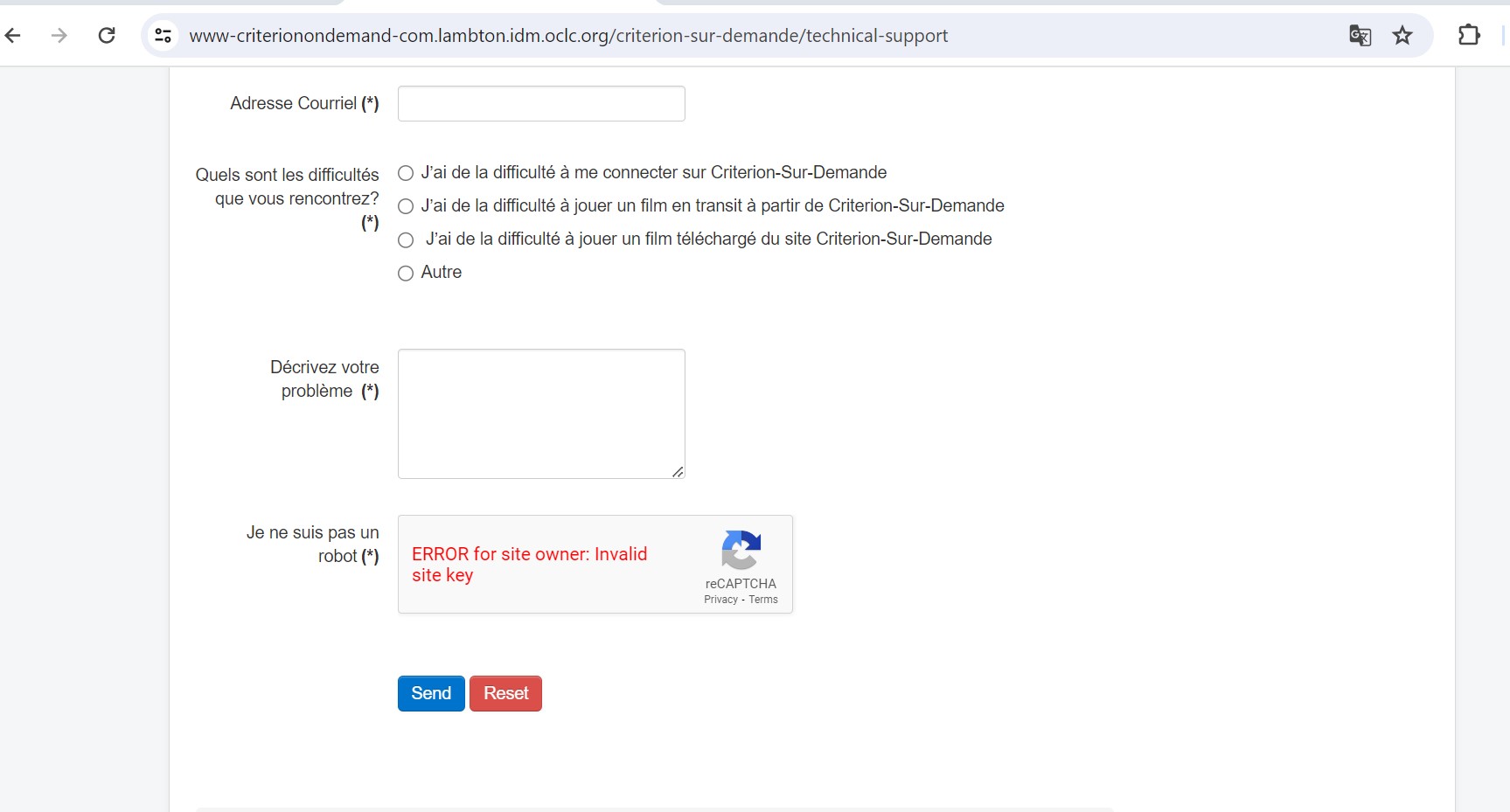
In the French version of the site, under technical support, the recaptcha is generating an error.
Several of the buttons on the French version of the pages, and options in drop down menus have not been translated into French.
Accueil: "Back to top"
in bread crumbs Home is not translated as "accueil", as it should be.
Rentable: incomplete typing of link name "cliqu" should be "cliquez ici"
Soutien Technique: Sentence not translated: If you experience difficulties logging in automatically, please click on this link and enter your user name and password.
No translation for buttons "Send" and "Reset"
Contactez-nous: Recaptcha is not translated. It says "Verify you are human"...link says "refresh"
No translation for "Send" button.
Ouverture de session icon in top right generates 404 error.
Silverlight information is in English only.
On results pages for genres in French, the hint is untranslated: (hint search may be revised at bottom of page)
There is no translation for "submit" and "reset". In a dropdown menu there is an untranslated "poster layout". Under "langue" dropdown, none of the languages have been translated into French (for example "Chinese" should say "Chinois"). There is no translation of "Country of Origin", and the drop down list of country names has not been translated (for example, Australia should be Australie).
If someone enters information in a form, and there are errors that generate corrections message(s), the "reset" button does not work.
The French version of the website is missing a page to allow clients to suggest titles...there is no equivalent link page to the one in English that says "Title suggestions"
Score: 1
Notes: "Log In" button does not seem to do anything that has to do with logging in...it generates a search page with the search "*".
Under the tab "about Criterion on demand" there is a menu choice for "Title suggestions". The actual page for this link loads in a flicker...I couldn't even see it for the first 3 days that I looked at this website. A pop up appears instead that asks clients to do some research. This pop up seems to be on a timer and disappears (10 seconds later...I timed it), finally revealing the hidden "title suggestions form". There is a good chance that this form is effectively inaccessible to all users.
Clipshout function has many results that will not individually open to play, due to 500 "internal server error".
The "top subjects" page is missing a link to the home page via the corporate logo in the top left corner.
In the French version of the site, under technical support, the recaptcha is generating an error.
Several of the buttons on the French version of the pages, and options in drop down menus have not been translated into French.
Accueil: "Back to top"
in bread crumbs Home is not translated as "accueil", as it should be.
Rentable: incomplete typing of link name "cliqu" should be "cliquez ici"
Soutien Technique: Sentence not translated: If you experience difficulties logging in automatically, please click on this link and enter your user name and password.
No translation for buttons "Send" and "Reset"
Contactez-nous: Recaptcha is not translated. It says "Verify you are human"...link says "refresh"
No translation for "Send" button.
Ouverture de session icon in top right generates 404 error.
Silverlight information is in English only.
On results pages for genres in French, the hint is untranslated: (hint search may be revised at bottom of page)
There is no translation for "submit" and "reset". In a dropdown menu there is an untranslated "poster layout". Under "langue" dropdown, none of the languages have been translated into French (for example "Chinese" should say "Chinois"). There is no translation of "Country of Origin", and the drop down list of country names has not been translated (for example, Australia should be Australie).
If someone enters information in a form, and there are errors that generate corrections message(s), the "reset" button does not work.
The French version of the website is missing a page to allow clients to suggest titles...there is no equivalent link page to the one in English that says "Title suggestions"
Can users pause carousel movement?
Answer: Sometimes
Score: 1
Notes: The French home page has a carousel with a pause button mid-pane.
The English screen does not.
Score: 1
Notes: The French home page has a carousel with a pause button mid-pane.
The English screen does not.
Is all functionality, including navigating between carousel items, operable by keyboard?
Answer: Never
Score: 0
Notes: Neither home page carousel (English or French) appears to be accessible when navigating with tab keys.
Score: 0
Notes: Neither home page carousel (English or French) appears to be accessible when navigating with tab keys.
Is the order of the text preserved at all screen resolutions, without overlap?
Answer: Always
Score: 2
Notes: The order of the text is preserved for all devices.
However, on the iphone there is a lot of scrolling both vertically and horizontally.
The fit is much better on an ipad screen, though there is still some scrolling.
Score: 2
Notes: The order of the text is preserved for all devices.
However, on the iphone there is a lot of scrolling both vertically and horizontally.
The fit is much better on an ipad screen, though there is still some scrolling.
Do images avoid overlapping at all screen resolutions?
Answer: Always
Score: 2
Notes: The images never overlap on devices.
However, on the iphone there is a lot of scrolling both vertically and horizontally.
The fit is much better on an ipad screen, though there is still some scrolling.
Score: 2
Notes: The images never overlap on devices.
However, on the iphone there is a lot of scrolling both vertically and horizontally.
The fit is much better on an ipad screen, though there is still some scrolling.
Is the overall reading experience preserved at all screen resolutions?
Answer: Sometimes
Score: 1
Notes: On the ipad, the overall reading experience is nearly preserved, with some scrolling.
On the iphone the reading experience is not preserved. The content is present but the scrolling required is immensely frustrating.
Score: 1
Notes: On the ipad, the overall reading experience is nearly preserved, with some scrolling.
On the iphone the reading experience is not preserved. The content is present but the scrolling required is immensely frustrating.